
Persona 4
14-year-old female, the youngest child in a military family, navigating adolescence while frequently relocating.
-
Values friendships and personal hobbies.
-
Seeks stability and independence.
-
Faces pressures from military life and aims to maintain relationships despite relocations.
Personas and tone of voice
Friendly • Functional
A friendly/playful tone for YOUth Matter engages and resonates with youth, making the content relatable and fun. It encourages participation, reflects the energy of youth programs, and builds a supportive, welcoming environment while giving this sub-brand a unique identity within the KMFRC family.
Primary Colours
Use primary colours for the main elements of the branding, such as primary headings, and major graphic elements. These colors establish the core identity of the brand.


Accent Colours
Avoid using this palette excessively in the overall design. These colours should be reserved for elements like illustrations, highlights, borders, and decorative details. If used as background, it should be used in a series of artworks where there is more that 1 artworks and the teal should be included


fredoka
Usage: Main Heading
Use this come only for Design purpose. It is perfect for youth titles with its playful, bold design that grabs attention and adds a fun, creative vibe. It pairs well with Verdana, offering a vibrant contrast that enhances visual appeal.
ABCDEFGHIJKLMNOPQRSTUVWXYZ
0123456789.&?!$
Verdana
Usage: Main text and Sub-heading
Verdana will be used as main text for clarity and consistency purpose.
ABCDEFGHIJKLMNOPQRSTUVWXYZ
ABCDEFGHIJKLMNOPQRSTUVWXYZ
0123456789.&?!$
0123456789.&?!$
🎉 Hey YOUth!
Ready for some fun and mindfulness?
🌟 Join us every Monday at the KMFRC for our weekly drop-in event for ages 12-18!
Kick off the week with mindfulness sessions, hang out with friends, and enjoy some awesome activities (plus snacks!). Let's make Mondays matter!
Register now and see you there! #YOUthMatter #MindfulnessMondays #KMFRCYouth

Social media in action
The YOUth Matter templates follow the KMFRC branding but with a bold, funky twist. They’re designed to be engaging, dynamic, and youth-friendly while staying true to the brand. Use colors from the YOUth Matter palette creatively—mix, match, and experiment, but keep it balanced. Each template serves a purpose, so choose the right one based on your message and format. Have fun, but keep it clear, readable, and on-brand!
.png)
.png)
.png)
.png)
CTA
Be playful with colors, but ensure they complement the overall design
Images
Use vibrant and engaging visuals to capture the attention of young audiences.
CTA Text:
Compared to the standard KMFRC branding, you have more flexibility to explore bold and dynamic colors.
Color Usage
Feel free to experiment, but maintain readability and alignment with the YOUth Matter style.
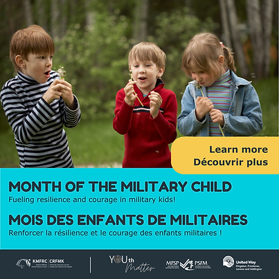
Templates for Consistency & Clarity
To ensure clear and engaging communication, we’ve designed a dedicated set of templates tailored for YOUth Matter. These templates maintain the core structure of the KMFRC brand while introducing more dynamic elements through color, imagery, and layout. This balance keeps the visual identity cohesive while making content more vibrant and youth-focused. Like all KMFRC templates, they are bilingual to ensure accessibility in both English and French.
Note: Keep text minimal for clarity and impact, as youth audiences are less focused on text-heavy content. Use social media captions for longer messages to maintain clean and visually engaging layouts.
Guideline: Feel free to experiment with colours within the YOUth Matter palette and KMFRC palette and adapt the design to fit your message, but avoid using more than three colours in a single artwork to maintain visual harmony.
.png)


