Shades of blue
Blue portrays security and reliability, making it ideal for representing an organization dedicated to serving military families. Blue is used prominently in the KMFRC branding to instill confidence and convey a strong, stable presence.


Shades of grey
The shades of grey are our newly added hues. They help to enhance accessibility, functionality, and sophistication. The inclusion of these new hues also adds a level of professionalism and functional tone to the brand's visual identity, creating a more modern and refined aesthetic overall.


Shades of warmth
These colors are designed to create a nurturing and inviting atmosphere, embodying our commitment to supporting military families. By incorporating these shades into our branding, we aim to foster a sense of connection and comfort within the community we serve.
Additionally, these colors provide more options when designing, allowing for greater flexibility and creativity in our visual communication.


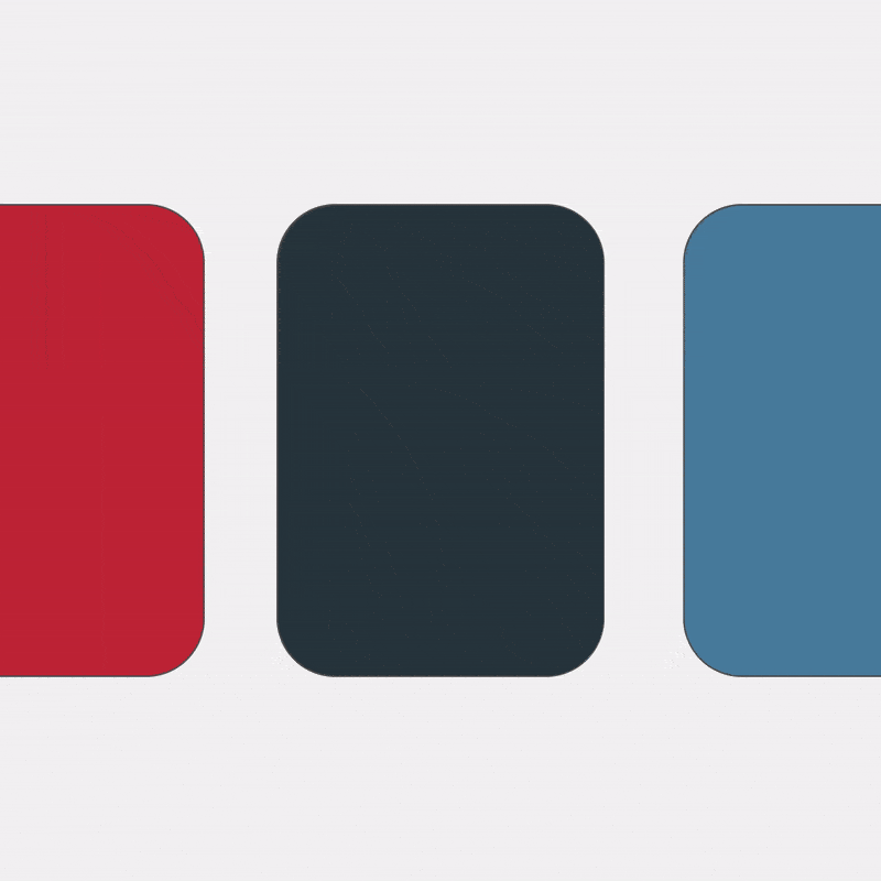
Red
Red is used for Call to actions, some titles and buttons

How to use colours
Creating information hierarchy with colours

What not to do with colours
Don't overuse dark colors for background.
Using dark colors excessively for backgrounds can make text hard to read. Maintain a balance for optimal readability and visual appeal.

Don't deviate from brand colors.
Using colors that are not part of the KMFRC color palette can weaken the brand identity and create inconsistency. Stick to the approved colors for a cohesive look.

Don't use too many colors.
Using too many different colors in one design can make it look cluttered and unprofessional. Keep the color scheme simple for a clean and cohesive appearance.
