KMFRC logo
support, community, and connection
The logo features a modern, clean design that incorporates the organization's colors and symbols.
It prominently displays the KMFRC acronym in Navy Blue, ensuring strong readability and professionalism. The accompanying icon, a stylized representation of a supportive embrace, is rendered in dark blue, medium blue and light blue, symbolizing trust and reliability.

Primary branding
Use as the main visual identifier in all official communications and materials (stationery, business cards, brochures, documents).
Digital presence
Display on the KMFRC website, social media profiles, and email signatures.
Marketing materials
Include in advertising, promotional items, and event materials.
Signage and displays
Feature prominently on building signage, banners, and exhibition booths.

Alternate branding
Use the secondary logo in design scenarios where the main logo doesn't fit well due to background colors or layout constraints.
Digital presence
Display the secondary logo on websites, social media profiles, and email signatures, particularly when the background is dark or when a lighter logo enhances visibility
Marketing materials
Utilize the secondary logo in promotional items, merchandise, and event displays where its design complements the overall aesthetic better than the main logo.
Versality
Apply the secondary logo to various branded items such as apparel, mugs, and tote bags, especially when a lighter logo is preferred for these products.
Alternate Logo
There may be no better way to communicate what we do than through images. As you browse our site, take a few moments to let your eyes linger here, and see if you can get a feel for our signature touch.


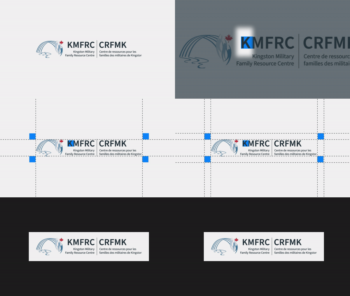
Clearspace
The exclusion zone ensures the legibility and impact of the logo by isolating it from competing visual elements such as text, graphics and imagery. The diagrams show the correct amount of space that should surround the logo.
No accompanying text or logos should appear in this area.


The clearspace around the logo can be determined by utilizing the width of the “K” from the logo.
Logo dont's
Do not alter the logo. Avoid the following common mistakes.
Partnership lockups
When locking the logo up with partner teams, venues and events, we should use consistent spacing to create a uniform composition across all lockups.


